Everybody makes mistakes. Maybe you made a change on your website, such as a registration form process, and now people don’t like it.
Well, you can always just plug your ears and ignore the feedback, or you can…
Win by applying what you’ve learned from negative feedback
Speaking of negative feedback, I mentioned last week that the sequels to three classic Nintendo games introduced major changes that received mixed. To my recollection, the only major sequel that seemed to generate solid praise was Mega Man 2, which didn’t change much except remove the pointless point system and introduce some of the greatest video game music ever.
But we’re not talking about Mega Man, we’re talking about how score points by turning around a poor user experience.
Third Time’s the Charm
When the third installments of Super Mario Bros., Legend of Zelda and Castlevania came along, the games appeared to return to they’re respective roots. For example:
- Mario could stomp on enemies again to swish them. No more pulling up radishes and onions.
- The Legend of Zelda displayed a birds-eye view again with combat style similar to the first game. No more Death Mountains with everything alive trying to kill you.
- The Belmonts engaged in a lot less talking to townies and a lot more skeleton-whipping action. The morning sun had finally vanquished the horrible night.
While it seems the game creators learned lessons by going back to the previous experience, they still incorporated some new innovations.
How Classic Video Games Gave the Best of Both Worlds
Break down major goals into baby steps
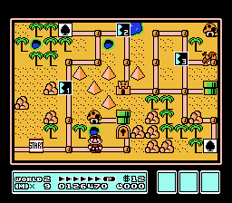
When Super Mario Bros. 3 came out, Mario went back to stomping on enemies, collecting coins, and eating Super Mushrooms as usual. But the game offered a new over world view where players could see the entire world with each level laid out in a roadmap. The goal for each world was to get to the castle, and the levels represented the steps to get to that goal.
Takeaway
Make the goal clear to the user, and use content to act as steps to help the user get to that goal. For example, if you sell a gift chocolate subscription program, instead of just dumping information on the user (a.k.a. Death Mountain) or just thrusting a call-to-action button into someone’s face, guide the user with baby steps to get to the goal:
- Start with the character: The user.
- Examine the problem: The user wants a gift for somebody
- Reveal the solution: Gift chocolate subscriptions make loved ones happy, and you don’t have to remember
- Verify the solution with evidence, such as:
- Science: “Chocolate has anti-oxidants and nutrition!”
- Testimonials: “Gift chocolate saved my marriage!”
- Explanations: Break down complex words to aid the user.
- Examples: “Subscribe once and forget it! We’ll remember to send chocolates on your anniversary.”
- Process: Visually show how the chocolates are created and shipped.
- Engage the baby steps with a clear call to action: Buy now!
You’ve now got a formula for building landing pages. However, don’t assume you have to give every user the same experience.
Offer custom experiences to carry out the same goal
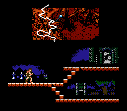
In Castlevania III, no longer did a Belmont need to invest in oak stakes. Instead it was back to classic whipping baddies until you got to Dracula. But the game introduced the ability to choose different paths to get to the same overarching goal: defeat Dracula. Depending on which path you chose, you could recruit other characters to join you in your quest, which gave you more powers.
Takeaway
Consider offering multiple customized paths to get people to the same goal. For example, if you’re a coach that specializes in helping children with learning issues, you might want one landing page to cover dyslexia and a much different page to cover hearing loss, but both leading to the same contact form to get in touch with you.
So far we’ve addressed ways of dealing with content structure and landing pages. But let’s not forget the importance of telling a good story for users to step into.
Engage in story
Most of the “stories” in classic video games were either vague or sometimes didn’t exist. Unless you had the original game manual, you might have no idea what was going on. Unfortunately, many websites suffer from this problem of dropping a user in with no story explaining why they’re there and what they’re supposed to do.
If you played Zelda I & II, you could skip the one-page, poorly translated story and getting straight to the action. However, the third installment, A Link to the Past, immersed in the story throughout the entire game. The story wasn’t something that got skipped but something introduced and reaffirmed throughout the gameplay.
Takeaway
Engage your audience in a story. I recommend following Donald Miller, Ray Edwards, and Jeff Goins for their ideas on how to craft a story instead of having just walls of endless words and bullet points.
Who wants to press the Restart button?
Hopefully these comeback ideas will help you with “restarting” the game on your website.