Last week I wrote how principles from classic video games can help you improve your website. Did you know you can learn these some principles the hard way?
When I wrote that you could learn principles from video games, I didn’t mean you should copy every principle. Otherwise, you could end up with a website that confuses, punishes and even deceives users.
Lessons learned from sequel blunders
When the original Super Mario Bros., Legend of Zelda and Castlevania were released, most people loved them because they introduced new gameplay mechanics and graphics that hadn’t been seen before.
Then their sequels came out. Let’s just say to this date they’re a topic of diverse opinions. I played each of these when I was younger, and while I like every one of them, many consider these sequels the “black sheep” of each of their respective franchise. Each of these sequels sent their respective franchises in a different direction and there’s three great lessons we can learn from them.
Don’t confuse users with inconsistent UI/UX
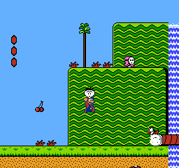
In Super Mario Bros., you collected coins, hit bricks and stomped on mushrooms. But in Super Mario Bros. 2, instead of stomping on baddies, you pulled up vegetables and threw them at baddies.
I like the game, but the gameplay was radically different, resulting in a completely different user interface (UI) and User experience (UX). Perhaps you’ve heard the acronym “UI” or “UX”, but keep in mind that they’re not the same thing. Using video games as an example:
- User interface (UI): The player presses the B button to make Mario pull up a vegetable.
- User experience (UX): The player gets confused or angry because Mario has to pull up vegetables to toss at enemies instead of squish them like in the original Super Mario Bros.
Takeaway from Super Mario Bros. 2
Keep a consistent user interface (UI) so you can improve user experience (UI). A simple style guide or pattern library for your site can help with this. I’ve discovered that a simple guide like Style Tiles works as a good start.
Don’t send users to “Death Mountain”
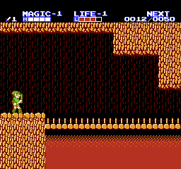
Zelda II: The Adventure of Link also radically changed from showing a birds-eye view of the screen to mostly a side scroller.
I like Zelda II over the first one, but it both critics and lovers can both attest to its difficulty. For example, there’s a “Death Mountain” where you faced a certain death due to the mountainous onslaught of enemies. This part was so punishing that I gave up because I felt like I couldn’t finish the game.
Who wants to go to Death Mountain? Anyone?
Takeaway from Zelda II
Beware of “Death Mountains” on your website. They can seem as long, grueling forms when someone’s just trying to get some basic information. They may be long 100-page eBooks, so jam-packed with information that readers don’t bother. Bottom line: Keep Death Mountains in the Zelda franchise and off your website.
Don’t mislead users and utterly let them down
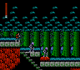
Where Castlevania provided a clear path with a few obstacles, Castlevania II: Simon’s Quest provided an obscure path with a few outright lies. When you start the game, instead of appearing outside a castle ready to whip zombies, you’re in a town and need to ask people for clues.
Well that sounds like a nice adventure, right? Clues and going on a quest – who’d object to that? You might, if you realized many of these “clues” were completely irrelevant or downright lies. There’s an endless debate about whether this was due to translation errors from the original Japanese, or intended deception, but here’s some examples:
“Invest in an oak stake?”
Some stranger inside one of the castles
Hmm… Is this random fellow offering an “investments” in wood and paper commodities? No, you need the oak stake to collect an item, which really isn’t explained to you unless you read the manual.
“Hit Deborah Cliff with your head to make a hole.” – ‘Helpful’ townsfolk providing a supposed clue
Hitting your head will do nothing, and there’s no hole to make. You have to kneel for a few seconds with a certain gem for a tornado to transport you to the other side appear.
“Don’t look in the Death Star or you’ll die.”
Townsfolk from a town far, far away
In Simon’s Quest, you’ll never see a Death Star or any other thing related to the Star Wars universe.
Anyway, the only way to beat the game back then in the pre-Internet world was to pickup a copy of Nintendo Power so you could understand these “clues”. Otherwise, the game was completely unbeatable, not because the enemies were too difficult, but because it was improbable to navigate to critical sections in the game based on the “clues” alone.
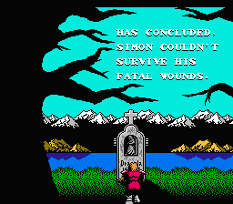
The worst part of the game is the ending, where you fight a wimpy version of Dracula and get rewarded with an ending that says you succumbed to your wounds and died anyway.
Thanks. I’m surprised that didn’t ruin my childhood.
Takeaway from Simon’s Quest
As John Lennon once put it, “Don’t let me down.” Don’t mislead users and let them down. Instead, give them a clear path and a real reward for their effort.
Game over. Continue?
So were these game franchises able to recover from these disappointing sequels? Find out next week.